- No Products In The Cart
- start shopping





Mobile-Responsive Web Design
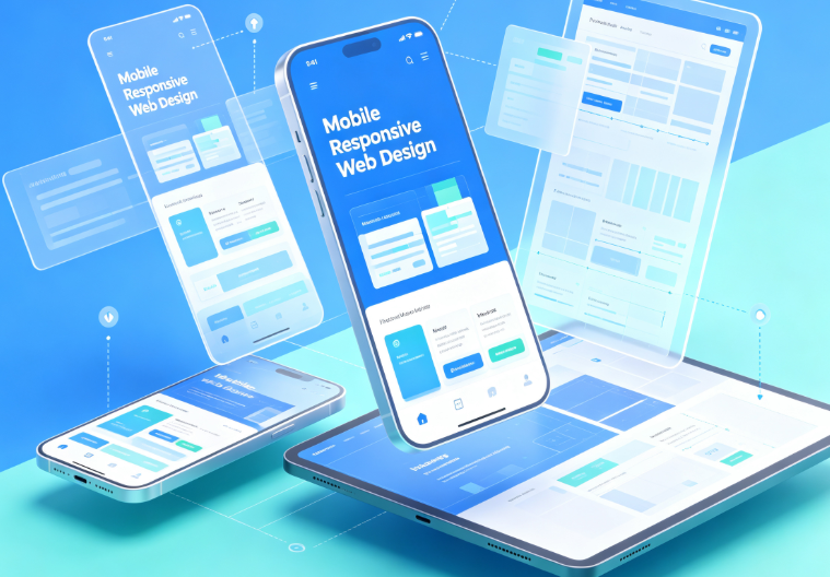
Mobile-Responsive Web Design
$412.00


Mobile-responsive web design focuses on optimizing the browsing experience across devices with varying screen sizes, using flexible layouts and adaptive technology to automatically adjust content. The design optimizes menus, text, images, buttons, and content arrangement for mobile browsing habits, ensuring key information is clearly displayed. It also ensures consistent rendering on tablets and desktops, preventing layout issues across devices. Suitable for corporate sites, e-commerce stores, brand showcases, and marketing pages, it provides a seamless and convenient cross-device browsing experience.